An urban take on Mexican tradition
Client:
Chida
Industry:
Food & Beverage
Services:
Visual Identity Design
Chida brings modern swagger to Mexican flavor—bold, colorful, and unapologetically cool. Set in the heart of Charlotte, Chida flips the script on traditional Mexican dining with an urban edge, inventive plates, and a vibe that feels equal parts authentic and effortlessly fresh.
The brand is a love letter to the city itself. Inspired by Charlotte’s skyline and energy, the logo nods to the urban landscape, while a vibrant, warm palette channels both the city’s style and Mexico’s rich cultural soul. The result? A confident, cohesive identity that celebrates local pride, big flavor, and culinary creativity with attitude.


Dimension with attitude
The Chida logo strikes a balance between bold, modern attitude and hands-on authenticity. The custom wordmark comes to life through punchy, three-dimensional letterforms drenched in a fiery coral red, chosen to spark warmth, energy, and straight-up appetite. Angled perspectives and carved-out interiors add depth and architectural bite, grounding the mark in a sense of place and community.
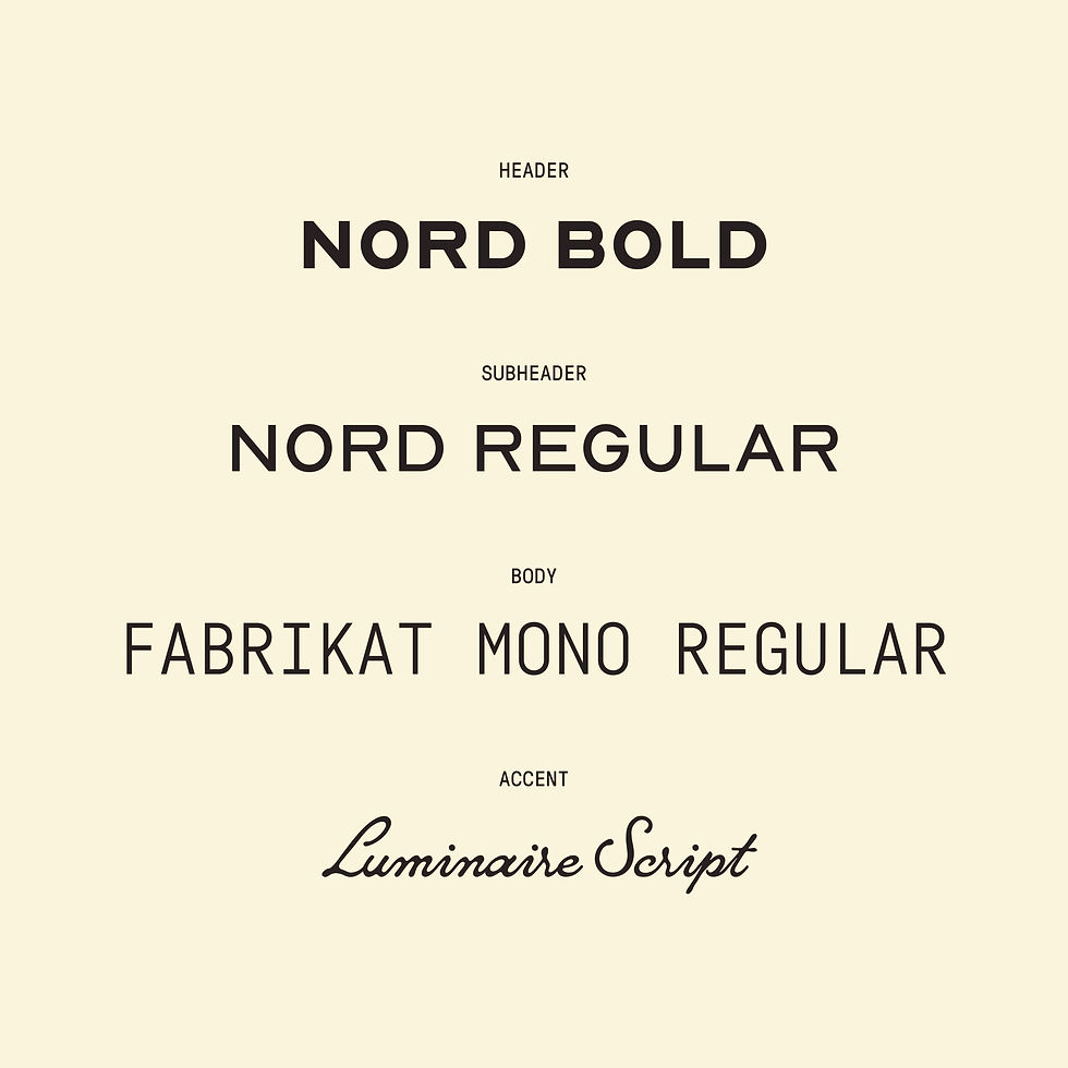
Paired with a clean geometric sans-serif and an unexpected handwritten script, the system plays with contrast—structured yet expressive, polished yet personal. The result is a dynamic, layered identity that feels vibrant, cultural, and unmistakably Chida, built to flex seamlessly across both digital and print without losing its edge.


Where flow meets form
The wordmark leans fully into the brand’s approachable, creative side with a smooth, hand-drawn script that feels effortless and human. The loose, flowing letterforms bring warmth and personality, while a consistent stroke weight keeps things crisp, modern, and intentional, not messy.
The standout capital “C” steals the spotlight, pulling double duty as both the hero of the wordmark and a standalone icon. It’s bold, recognizable, and built to flex wherever the brand shows up. The result is a mark that feels casual but confident—equal parts charm and edge—perfectly capturing a brand that leads with creativity, friendliness, and attitude.


